


Uncle Ike’s To-Go Bag Redesign

Project Type: Packaging / Illustration / Brand Collaboration
Role: Illustrator & Product Designer
Tools: Procreate
Timeline: 3 Weeks
Deliverables: Custom illustration, design layout, mockup
Project Overview
Summary
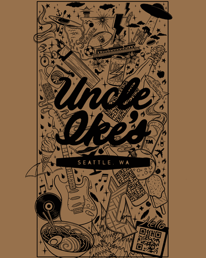
Uncle Ike’s is one of Seattle’s most recognizable cannabis retailers — bold, modern, and rooted in the city’s creative culture. This redesign of their to-go bag blends the brand’s eccentric tone with playful illustration, transforming a simple product into a collectible piece of Seattle design.
Objective / Problem:
Uncle Ike’s needed a refreshed bag design that captured Seattle’s creative energy while staying true to their modern–midcentury aesthetic. The previous version felt disconnected and it didn’t fully showcase the culture of the city, region, or the local community behind the brand.
↓
Scroll Down
↓
Process
I start every project by figuring out what it actually needs to do, not just how it should look. From rough sketches to final builds, it’s all about testing ideas early, cutting what doesn’t work, and keeping things clean, consistent, and intentional.


Research + Discovery:
I looked into cannabis packaging brands and Uncle Ike’s own visual system to find ways the design could better capture the creative energy of the city and area.
Ideation + Sketching:
Developed a concept inspired by “all things Seattle,” such as culture, music, and the local area. I focused on visual storytelling through expressive line-work.
Digital / Print Illustration:
Refined the original sketches in Procreate, experimenting with line, space, and shape. Balanced playful elements with harmony and unity.
Collaboration
+ Feedback:
Shared digital iterations with Uncle Ike’s team, working closely with their feedback helped refine the final layout and design.

Solution
+Final Design
The end goal is a quality design that looks good, works well, and feels natural to use. Every element serves a purpose, from the layout to the details. The final design brings everything together into a system that feels intentional, cohesive, and ready for the real world.
Final Design
The final design balances clean composition with an illustrative personality unique to the Pacific Northwest.
It connects the brand to its local roots and strengthens authenticity through unique illustration and artful storytelling.
Results / Reflection
Transformed Uncle Ike’s to-go bags into a collectible art piece.
Received positive feedback on authenticity and showcasing local culture through design.
Gained experience blending illustration with brand systems to maintain consistency while adding a personal touch.
Designer’s Note:
Uncle Ike’s Fourth Edition — This marks my fourth edition designing Uncle Ike’s signature to-go bags, created annually from 2015 to 2019. Each design captures a new side of Seattle’s culture, and this latest version continues that legacy by blending my illustration style with the brand’s bold personality.
Uncle Ike’s
To-Go Bag Redesign
Project Type: Packaging / Illustration / Brand Collaboration
Role: Illustrator & Product Designer
Tools: Procreate
Timeline: 3 Weeks
Deliverables: Custom illustration, design layout, mockup
Uncle Ike’s
To-Go Bag Redesign
Project Type: Packaging / Illustration / Brand Collaboration
Role: Illustrator & Product Designer
Tools: Procreate
Timeline: 3 Weeks
Deliverables: Custom illustration, design layout, mockup
Project Overview
Project Overview
Summary
Summary
Uncle Ike’s is one of Seattle’s most recognizable cannabis retailers — bold, modern, and rooted in the city’s creative culture.
This redesign of their to-go bag blends the brand’s eccentric tone with playful illustration, transforming a simple product into a collectible piece of Seattle design.
Objective / Problem:
Uncle Ike’s needed a refreshed bag design that captured Seattle’s creative energy while staying true to their modern–midcentury aesthetic.
The previous version felt disconnected and it didn’t fully showcase the culture of the city, region, or the local community behind the brand.
Process
Process
I start every project by figuring out what it actually needs to do, not just how it should look. From rough sketches to final builds, it’s all about testing ideas early, cutting what doesn’t work, and keeping things clean, consistent, and intentional.
Research + Discovery:
I looked into cannabis packaging brands and Uncle Ike’s own visual system to find ways the design could better capture the creative energy of the city and area.
Ideation + Sketching:
Developed a concept inspired by
“all things Seattle,” such as culture, music, and the local area. I focused on visual storytelling through expressive line-work.
Digital / Print Illustration:
Refined the original sketches in Procreate, experimenting with line, space, and shape. Balanced playful elements with harmony and unity.
Collaboration + Feedback:
Shared digital iterations with Uncle Ike’s team, working closely with their feedback helped refine the final layout and design.
Designer’s Note:
Uncle Ike’s Fourth Edition — This marks my fourth edition designing Uncle Ike’s signature to-go bags, created annually from 2015 to 2019. Each design captures a new side of Seattle’s culture, and this latest version continues that legacy by blending my illustration style with the brand’s bold personality.
Solution
+Final Design
Solution
+Final Design
The end goal is a quality design that looks good, works well, and feels natural to use. Every element serves a purpose, from the layout to the details. The final design brings everything together into a system that feels intentional, cohesive, and ready for the real world.
Final Design
Final Design
The final design balances clean composition with an illustrative personality unique to the Pacific Northwest.
It connects the brand to its local roots and strengthens authenticity through unique illustration and artful storytelling.
Results / Reflection
Results / Reflection
Transformed Uncle Ike’s to-go bags into a collectible art piece.
Received positive feedback on authenticity and showcasing local culture through design.
Gained experience blending illustration with brand systems to maintain consistency while adding a personal touch.
↓
↓
Scroll Down
Scroll Down
↓
↓